My Hope Story
Book Cover Design
Objective.
To design a minimal and cohesive book cover for My Hope Story, Volume One, a collection of personal testimonies about faith, hardship, healing, and hope. The cover establishes a visual direction that can grow into a recognizable series across future volumes.
Purpose.
Visually communicate themes of hope, faith, and renewal while creating an uplifting cover for the Hope Books brand. It needs to reach the primary target audience, women, and show how future volumes can maintain a consistent identity while developing their own unique covers.
Design.
The design uses a minimal visual style that aligns with the established Hope Books brand. Clean linework, elegant typography, and a monochromatic color palette create an approachable, bold look while leaving room for the series to evolve across future volumes. The cover imagery is Inspired by Matthew 6:25-34, using wildflowers as symbols of Gods deep care for us.
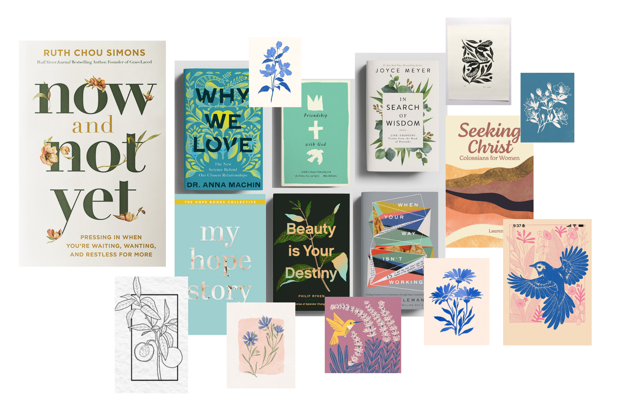
Starting with a Moodboard accomplishes two important things in my process. The first is that it allows my mind to explore ideas freely, understanding the general tone of the project, style, and place within its target demographic. The second is that it allows me to easily get my client to be on the same page visually with the direction I continue with for moving on to sketching concepts.
Moodboard Exploration
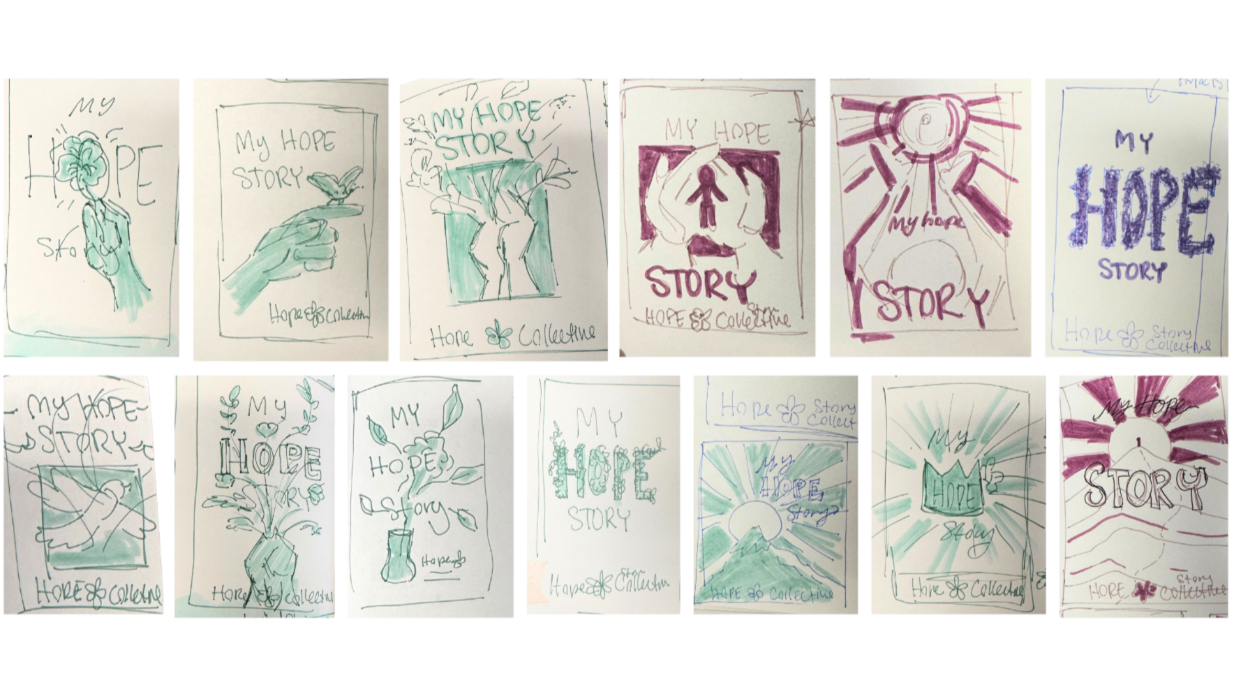
Physical sketching is important to my practice because it removes any opportunity to be perfectionistic. In this stage, I get to play around with new messy ideas, getting to discover solid concepts.
Physical Sketches
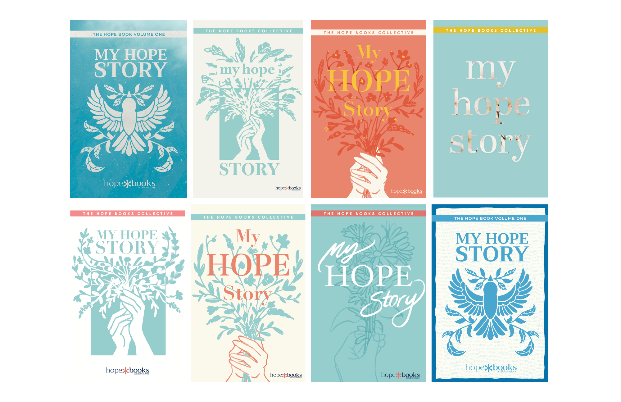
Once I have solid sketches, I move into the digital realm to keep ideating. This gives a clearer direction for the cover ideas, incorporating potential color, icons, imagery, and typography. I chose several concepts to pitch to my clients, and they picked three favorites to develop further.
Digital Ideation
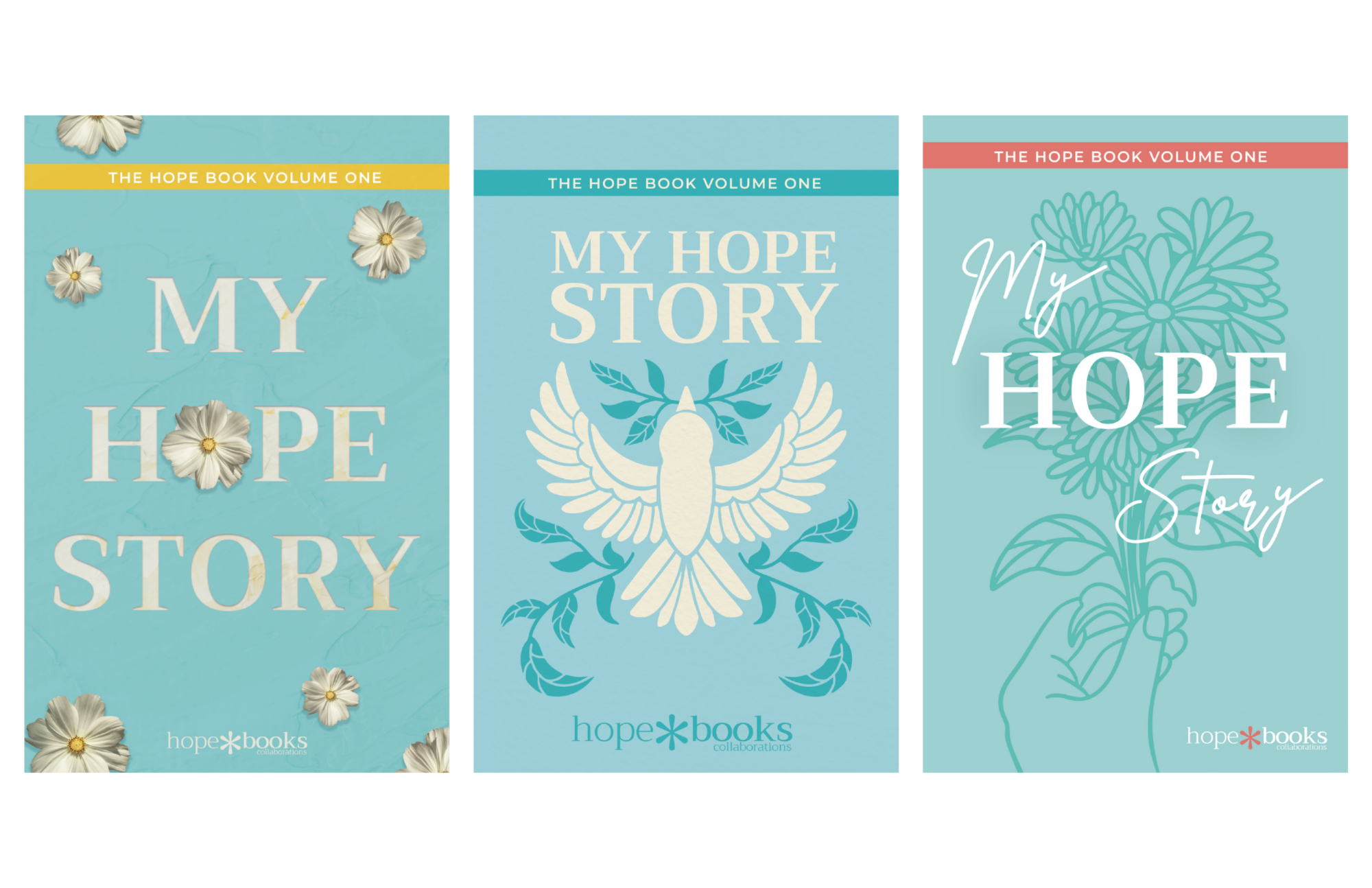
Three detailed concepts were presented and discussed with my client. I received feedback on which cover to move forward with. I then adjusted some client notes and completed the final design.
Final Three Concepts
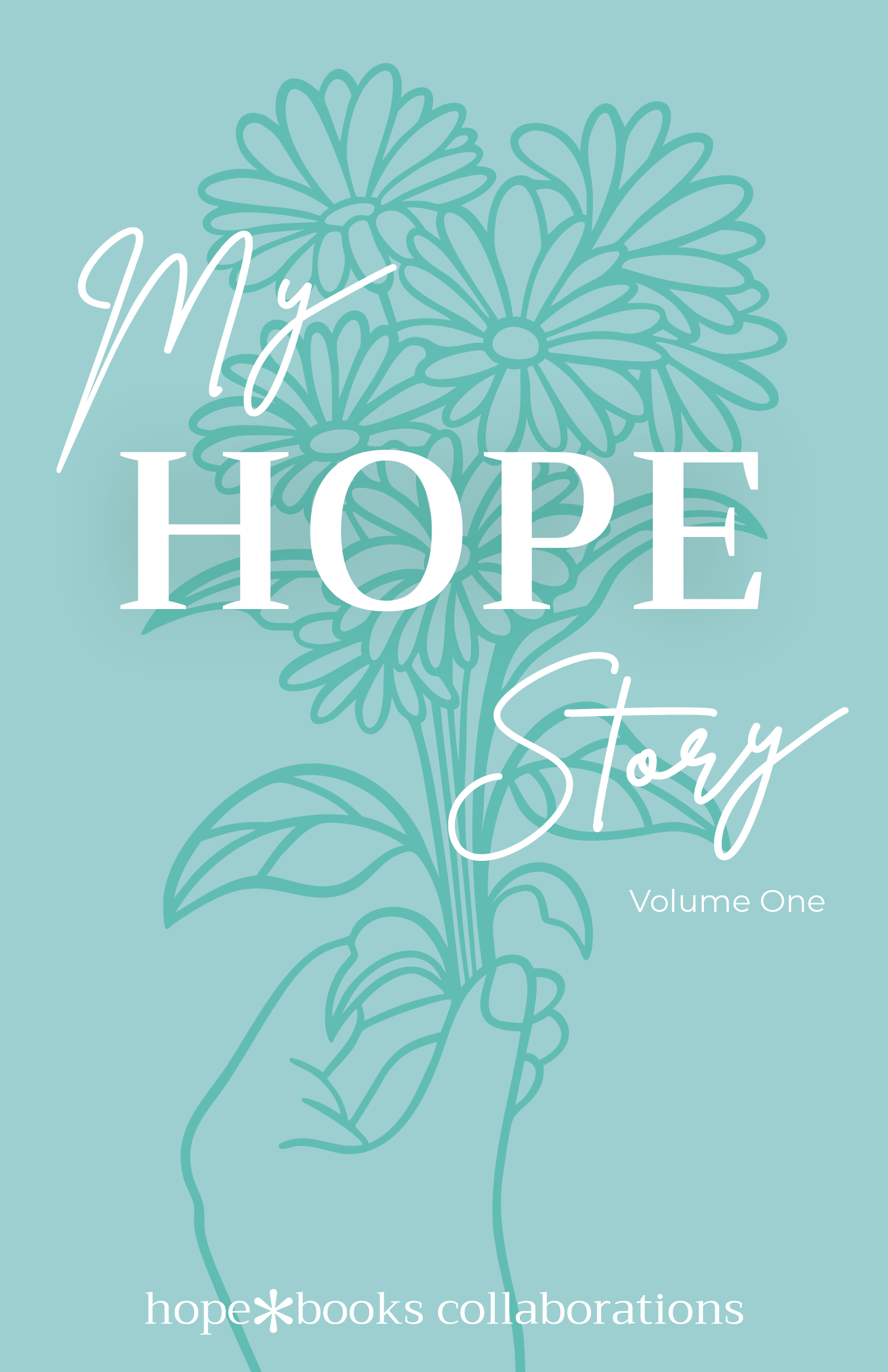
The final illustrated cover is complete. The idea gets brought to life through mockups; all needed assets get packaged and are sent to the HopeBooks design team.
Chosen Concept
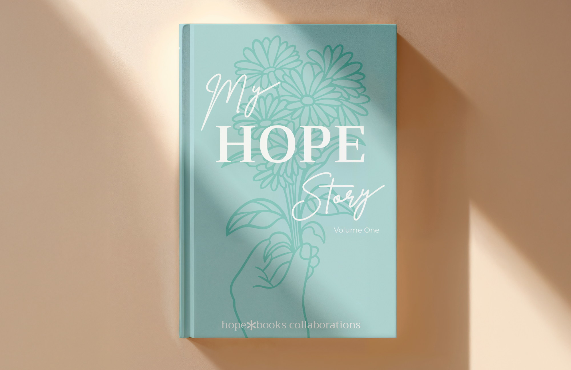
Final Visualized Product
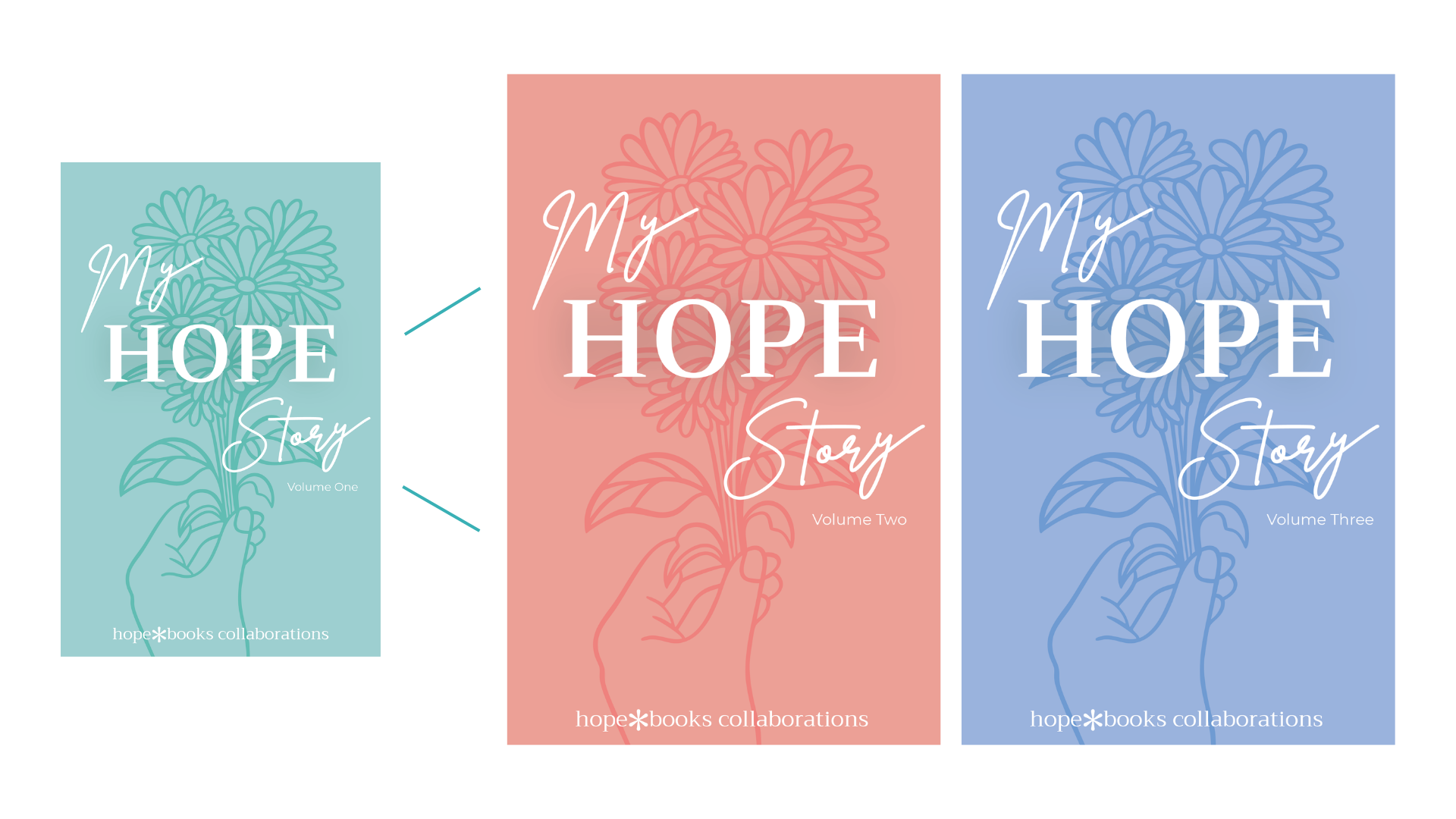
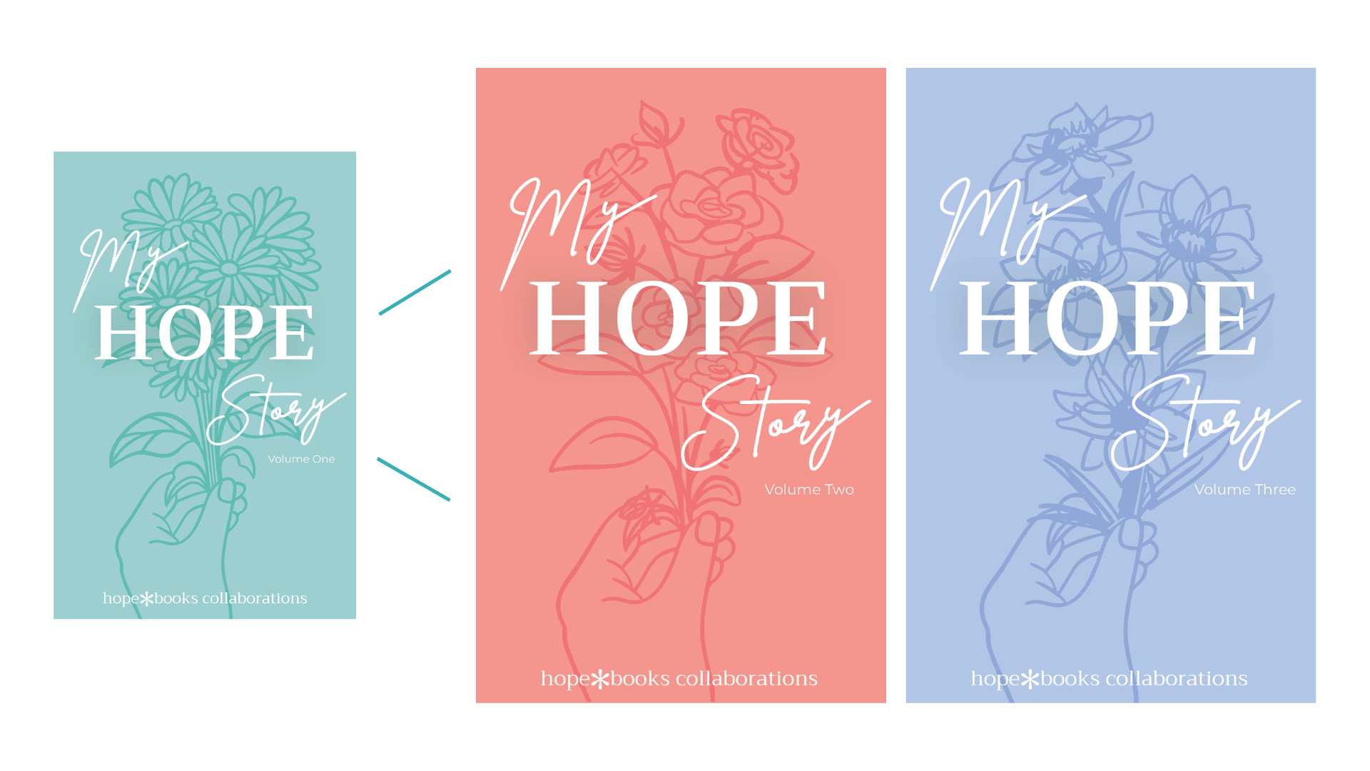
In addition to the first edition cover, Hopebooks also wanted the cover to be adaptable for future editions. I gave two ideas for possible expansion below. The first is to adjust the colors in a palette that stays cohesive between editions. The Second idea is to also change the flowers the hands are holding for each edition.
Future Volume Concepts